
Data can be very powerful. If you can actually understand what it’s telling you, that is.
It’s not easy to get clear takeaways by looking at a slew of numbers and stats. You’ve got to have the data presented in a logical, easy-to-understand way.
Enter data visualization. The human brain processes visual information better than it processes text – so using charts, graphs, and design elements, data visualization can help you explain trends and stats much more easily.
But not all data visualization is created equal. (Just check out “Why Most People’s Charts and Graphs Look Like Crap” to see what I mean.)
So, how do organize data in a way that’s both compelling and easy to digest? Get inspired by the following 16 examples of data visualization that communicate interesting information with both style and substance.
Click here to download our free guide to data visualization for more data visualization examples and tips.
What is Data Visualization?
Data visualization refers to representing data in a visual context, like a chart or a map, to help people understand the significance of that data.
Whereas data in text form can be really confusing (not to mention bland), data represented in a visual format helps people extract meaning from that data much more quickly and easily. You can expose patterns, trends, and correlations that may otherwise go undetected.
Data visualization can be static or interactive. For centuries, people have been using static data visualization like charts and maps. Interactive data visualization is a little bit newer: It lets people drill down into the dirty details of these charts and graphs using their computers and mobile devices, and then interactively change which data they see and how it’s processed.
Ready to feel inspired? Let’s take a look at some great examples of interactive and static data visualization.
Examples of Interactive Data Visualization
1) Why Buses Bunch
Here’s a wonderful example of a complex data set boiled down into what that looks and feels like a game. In this visualization, the folks at Setosa are showing how “bus bunching” happens, i.e. when a bus gets delayed and later causes multiple buses to arrive at a single stop at the same time.
Telling this story in numbers alone would be pretty difficult, but instead, they turn it into an interactive game. While the buses rotate along a route, we can click and hold a button to delay a bus. Then, all we have to do is watch to see how even a short delay causes the buses to bunch together after a time.
2) Languages in the World
This interactive by DensityDesign does an impressive job of introducing the non-linguist (aka most of us) to the many world languages. All 2,678 of them.
This piece allows you to explore common languages families, see which languages are most spoken, and view where languages are spoken around the world. This is great visual storytelling: taking an in-depth subject and breaking it down in an easy-to-understand way.
3) Percent of U.S. Population by Age Group
This is a strong example of how to present a single data set in a compelling way. Pew Research created this animated GIF composite to show shifts in population demographics over time. It’s a great way to tell a larger story in a neat package.
Plus, this type of micro-content is easy to share on social or embed in blogs, extending the content’s reach. If you want to make a GIF of your own using Photoshop, here’s a step-by-step tutorial.
4) The Complete History of the NFL
The world of sports is rich with data, but that data isn’t always presented effectively (or accurately, for that matter). The folks over at FiveThirtyEight do it particularly well, though. In this interactive visualization below, they calculated what’s called an “Elo rating” – a simple measure of strength based on game-by-game results – for every game in the history of the National Football League. That’s over 30,000 ratings in total. Viewers can compare each team’s Elo to see how each team performed across decades of play.
5) U.S. Thanksgiving on Google Flights
Here’s a great way to visualize things moving around in space over a given time. This one is powered by Google Trends, which tracked flights as they few to, from, and across the United States on the day before Thanksgiving. The visualization starts at the very beginning of the day and plays like a movie as time goes on, showing flights moving around the country. Without showing any numbers beside the time, viewers can see which times of day are more popular for international flights, for domestic flights, and for flights to and from different hubs around the country.
6) What’s Really Warming the World?
Ever heard a version of the advice, “Don’t simply show the data; tell a story with it”? That’s exactly what this visualization from Bloomberg Business does – and it’s the interactive part that makes the story move along from beginning to end.
The point of the visualization is to disprove theories that claim that natural causes explain global warming. The first thing you’ll see is the observed temperature as it’s risen from 1880 to present day. As you scroll down, the visualization takes you through exactly how much different factors contribute to global warming in comparison to what’s been observed, adding a richer layer of storytelling. The conclusion the authors want viewers to draw is made very clear.
7) A Guide to Who is Fighting Whom in Syria
Relationships among many different groups can be difficult to understand – especially when there are 11 of them, many of which are on the same side as groups they’re normally at odds with, and vice versa. Now that’s confusing. But using a table format and familiar visuals and colors, the folks at Slate did a great job simplifying this data into a simple, digestible, and interactive format.
Viewers can click on any of the faces for a succinct description of the relationship.
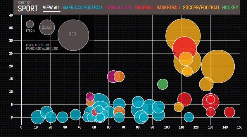
8) Most Valuable Sports Franchises
Here is an example of telling a deeper story by adding data. This interactive, created by Column Five, was inspired by Forbes’ “Top 50 Most Valuable Sports Franchises 2014” list. But instead of just visualizing the list, the interactive also lets users see the number of years each team has competed, as well as number of championships won. This offers a more comprehensive view of the each team’s history and success as a franchise.
9) U.S. Wind Map
Here’s a visualization similar to the Thanksgiving flights one, except this time, it shows all present wind speeds and directions in the U.S. in real time. It’s a great example of intuitive design: Speed is represented by lines moving slowly or quickly, and direction is represented by which way the lines are moving. It’s immediately clear what the general trends are without any need for numbers unless you click into the map itself. Plus, capping the number of variables at two makes it even easier to follow.
Examples of Static Data Visualization
10) Where News Audiences Fit on the Political Spectrum
Usually, when a designer has a lot of text that can’t be left out, they’ll usually organize that information into a data table in order to make it more compact, according to the folks at Pew Research Center. But they went for a distribution plot instead. Why? Because a distribution plot lets viewers see where each media outlet lies on a spectrum. On a spectrum, the distance between each media outlet is significant. If these outlets were just listed one after the other in a table, viewers wouldn’t be able to see where each one stood in context.
11) The Daily Routines of Famous Creative People
This data visualization is a simple concept executed fantastically. Using information from the book Daily Rituals by Mason Currey, the site showcases the daily schedules of famous creatives broken down by time and activity. Not only is this an example of engaging data (as you can explore the schedules by individual activity), it’s also a fantastic editorial piece for a brand.
12) The Year in News
The best data visualizations communicate information and do so in an intuitive and beautiful way. Echelon Insights nailed it with this piece, which visualizes the most talked-about news stories of 2014 on Twitter. What do 184.5 million tweets look like? Rad spin art.
13) The Depth of the Problem
When you want to illustrate scale, static data visualization can be a great way to make your point. The infographic below from The Washington Post is incredibly long … and that’s on purpose. In this case, they’re showing how crazy far a deep-sea signal from an airplane can be detected by comparing that depth to tall buildings, the maximum depth of known mammals, the depth of the Titanic wreck, and so on. It’s a great use of simple visuals and color gradients. Finally, adding data to a news story (in this case, the missing Malaysian airliner) is a great way to provide context.
(For the full size visualization, click here)
14) Funding the Final Frontier
While the infographic above is pretty simple, there are ways to create well-designed infographics that deliver a large amount of data. The secret? A simple and clean format that makes it easy for readers to understand the data. This infographic, created by GOOD Magazine and Column Five, breaks down NASA’s five-year budget to show how and where the money will be spent. Plus, it has an on-theme design – an all-around win.
15) Caritas Kontakladen Annual Report
Not all data visualizations need to be animated. When real-world data is visualized with real-life examples, the results can be stunning. Designer Marion Luttenberger took a unique approach to the data contained in Caritas Kontakladen’s annual report. The organization provides support to drug addicts in Austria, so Luttenberger focused on communicating the mission through real-life visuals. For example, this shopping cart visualization represents how much of life’s necessities a welfare recipient can afford each day.
16) Austria Solar Annual Report
While there are many ways to visualize data, using the information subject to actually create the data visualization (follow me here) can be pretty profound. This annual report from Austria Solar uses actual solar power to bring the company’s data to life through solar-activated inks on the page. In a word: Genius.
What are you favorite examples of data visualization? Share them with us in the comments.
Editor’s Note: This post was originally published in March 2015 and has been updated for freshness, accuracy, and comprehensiveness.
from HubSpot Marketing Blog http://ift.tt/1C1xWCj via music production
from Tumblr http://ift.tt/1Rt7bMD
No comments:
Post a Comment